The Moods of Color
How color affects art

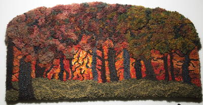
An Afternoon at the Arboretum, 18" x 26", #4- to 6- and hand-cut hand-dyed and as-is wools, Sari silk, cotton yarn, and raffia yarn; finished with dyed wool and show binding. Adapted from a photo by Tom Javorcic (used with permission) and hooked by Lisanne Miller, 2013.
When color planning a design, the vocabulary usually includes common names for colors and values. We discuss harmonious color combinations and balance of the colors; we select fabrics and get down to hooking. What if we also thought about the emotional message we wanted to convey with our piece? Consider how you feel in a room painted dark red or a room painted bright yellow. Public spaces are painted to calm people or excite them—why not do the same with your artwork?
I asked nine artists to create a design conveying their emotional reactions to color. They were encouraged use hues, values, and motifs to convey their story. Each explains their process.
Before reading further, play along. Choose a color: red, orange, yellow, green, blue, purple; or choose a value: light, medium, or dark. Write down words to describe your selection. Then create a composition with lines, shapes, and spaces telling a color story.
Colors can be divided into two categories: warm and cool. Warm colors are stimulating, energetic and active, but if too intense they can be hot, oppressive, and heavy. Cool colors are relaxed and passive.
As a generalization here is a list of primary colors (red, yellow, and blue) and secondary colors (orange, green, and purple) colors, the three value families, and reactions to each in reference to décor.
Red evokes a strong reaction of vigor and energy. It will draw attention over any color combination. See Anne Boissinot’s green rug and her comment: a little goes a long way. In Michele Wise’s piece, both warm and cool reds convey movement, mystery, friendship, and happiness.
Orange is stimulating. People often have strong opinions about orange, hating it or loving it. Dulled to terracotta or lightened to peach, these particular oranges are perennial favorites. Lori LaBerge thought of her youthful daughter and movement in designing her orange piece.
Yellow is optimistic. In nature, sunflowers bring smiles. On a sunny day, everyone is smiling. Nola Heidbreder’s rug depicts a joyful experience with family. Be careful, though: too much intense yellow will have people looking away.
Green is all around us in nature. We miss the variety of blue greens and yellow greens in bleak winters and welcome the screaming acid greens of early spring. Darker greens are rich and mysterious as depicted in Lisanne’s DARK piece. Lighter greens may be healing, and in the Aurora Borealis of Anne Bossinot, mysterious.
Blue is always a favorite. You can get a calming feeling from lighter blues, while dark heavy ones can feel formal, patriotic (American), or near evening. Donna Hrkman thought of water and movement with her mermaid in the sea.
Purple is luxurious, royal, playful—or dreary and depressing. Diane Stoffel went through these emotions as she traveled from a cool and grey winter in New England to sunny Florida, selecting a design and colors.
Dark values evoke nighttime, mystery, formality, or rich comfort. Lisanne used a photo with a mysterious feel and learned dark values need bright and light to be effective.
Medium values can depict the end of a rain storm, a washed-out scene in Australia as Kris McDermet portrays, or dusk/dawn. Dusk and dawn have minimal light sources allowing some of the colors to be defined, but there are no shadows. Kris notes this was the difficult part, so she did add darker lines to the hills and water for definition.
Light values are washed out because there is an abundance of light. Color is minimal, just hints of it come through. April DeConick teaches us about the value by learning more about light, the source. Her piece includes the full range of values (light to darkest) and a wide variety of colors in those values. The darks are necessary to enhance by her lightest values.
Advertisers, marketers of products, media, fashion and furnishings all use subliminal reactions to color and value. Visit the paint department and look at the literature on new colors. For example, trends in color for 2013 interpreted by Olympic Paints: “Using beautiful, bold color throughout your home. Bold brings joy and optimism, imparting youthful wonder. A shot of bright creates an eye-popping and energetic vibe.” How do you react to the annual trends in fashion? Will Emerald Green be the color to comfort and excite you in 2013 as Panetone predicts?
Visit galleries and museums and think of the moods artists evoke in their work. What colors and values did they use? Look around you during weather changes and when daylight fades into evening: how do you feel? Tell your story in the selection of colors, fabrics, and techniques.
Consider selecting a color you don’t normally use, and integrate it into the next piece as if you have something new to say. Change the mood of a room by choosing a different color background, and maybe change the value too.
Susan L. Feller is the author of Design Basics for Rug Hookers, a frequent writer for RHM, and owner of Ruckman Mill Farm in Augusta, West Virginia. She has an extensive line of rug patterns, artwools, and dye recipes, and she conducts workshops and retreats and teaches at rug schools internationally. Contact her through www.RuckmanMillFarm.com or the blog on www.Artwools.com.
References:
Sarah Sample, “Count the Colors” [song] on Never Close Enough, Ramona (2007).
Victoria Finlay, Color: A Natural History
This article is from the September/October 2013 issue. For more information on our issues, check out our issues page.
