
The Revisionist
Working with themes
Hooking isn’t quick and it is crushing for some to have to rework areas where colors don’t work well. Deciding on a clear theme is quite a helpful strategy. As you work along on your rugs, a solid theme helps eliminate questions about color placement and choices for borders.
A theme creates a set of color you use and return to when you don’t know where to turn. Your theme is a tool, waiting to help you choose colors to use together.
I created this Ogee rug with a theme in mind. In case you're wondering , an ogee is a geometric shape, a classic found in many many forms in the decorative arts. It's my favorite shape.
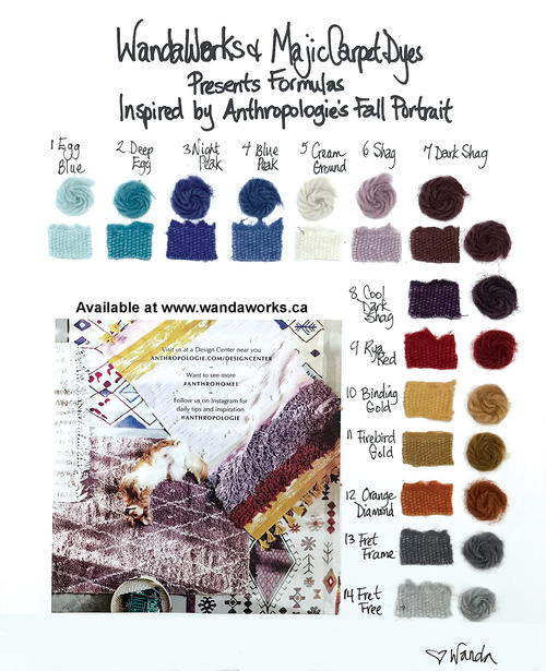
This tiny ad from the store Anthropologie inspired
my set of formulas, and I loved them so much I couldn’t wait to use them in a rug. The samples became the
color-plan theme.
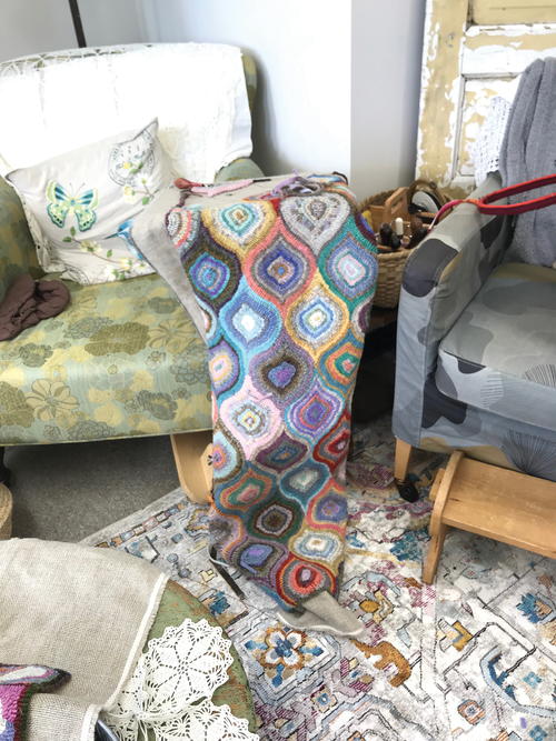
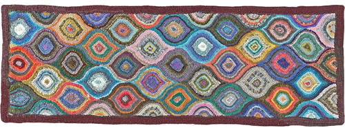
Here is the rug that’s finished—and yet not quite
finished.
I like how it looks but there are a few problem areas.
Let’s look at them.
Additional Images and Explanations
-
Anthropologie ad and dye samples
-
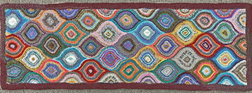
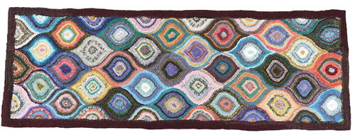
Ogee before revisions
-
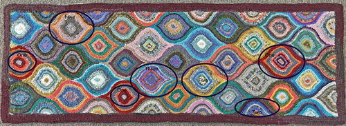
Here are the problems with my original Ogee
-
Problem #1:
Though I love the strength of that wonderful orange-red I call Rya Red, it seems like an “eye trap.” I’m not sure I want that. I liked the repetition but chose to take out parts of those strong ogees to lessen their impact. I tried a variety of things to reveal several changes you might want to try
» I lightened the one on the far right and cooled it and reduced the value contrast.
» For the problem on the middle bottom, I dulled and cooled the outside of the ogee and lightened the center red (my beloved Rya Red), and removed the very dark line near the middle, then chose a wool that dulled and lightened that line.
» The ogee on the far left was improved by simply using a lighter outside color.
You might wonder why I let those Big Bossy Babes stay in that rug until this article. I like to teach by showing errors and then suggesting how my students might avoid such pitfalls. I gave an ogee class in my studio, The Wandarosa, and it was wonderful to show something awry and then talk about how we might fix it.
It’s interesting also how offensive these 3 ogees are: to some, they create a strong reaction and even advice. All I had in mind was a good class and an article for you, though I do like to provoke new directions in thinking by creating ugly!!
Problem #2
In half ogee #2, there was a very dark outside that bled right into the border. I don’t like that. I like the action of a geometric rug like this to be stopped completely by the border. I lightened that line, and then saw I had another half ogee culprit doing the same on the opposite side on the other end. I’ll nip that one in the bud too.
Problem #3
This ogee contained alternating colors of strongly contrasting values. During class I tore out one of the strips making that contrast stripe, and the effect of relaxation was immediate. I never bothered filling that hole. In my revisions I removed the first violet line near the outside. Then I added in a similarly valued yellow strip in the place of the original violet one. That worked fine. I liked how the yellow added some vivacity in the pastel colors.
Problem #4
Although I admire deeply a plain ogee, I felt this one was a little too “tired” looking. I replace some dull colors with a dull yellow, just enough life to pep things up a touch.
Problem #5
These careful looks I give to my work when I’m ready to revise sometimes reveal things I’ve overlooked with my focus on pulling loops. Problem #5 is not with the coloration of an individual ogee but with its placement in the overall set up. -
Ogee revised
-
To decide which one to change I look at the neighboring ogees. Which one can I change without too much fuss? I don’t want to interfere with the neighborhood.
I chose to take out all the yellow and replace it with a cool green and a warm green. I see now this has created a trio of greyish ogees now in a little v. This re-visioning requires a couple of close looks. I replaced a few grays with something a little more powerful but the same value.
Here are the results of the first revision.
Revision #2: border
I want to sort out those dark lines in the half ogees and repair the too gray area.
And might I be happier with a cool border? Oh, did you notice two opposite corners of my rug are duller than the rest of the border? I did this on purpose—I like there to be some unusual quality to ponder over for the ultimate owners of this rug as long as she lasts.
Final decision: I like the border warm. I have a lot of coolly colored rugs in my arsenal and I’m enjoying seeing the novelty of the warm border.
Revision #3
I didn’t go far enough keeping lines of the same value from intersecting with the border. I had to change them to an even lighter color. -
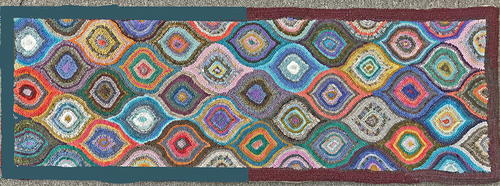
The final, complete Ogee, 53” x 19”, wool on linen. Designed and hooked by Wanda Kerr, Wiarton, Ontario, 2019. The final revision, in all her glory
-
Look Out—Revisions Can Devalue Your Personal Imprint
So now I have a rug I feel is a stranger to me. I made so many changes after looking at the rug in its original state I don’t recognize this rug at all. There is always the chance that the changes you make might be influenced by the comments of others (some of whom require a certain type of predictability in work they admire, and they do their level best to have you conform also).
This rug is pretty, but it is mine?
I’m finished with this fella. But I think I can do better. The solution is to make another one, take what I’ve learned here and take another stab at it.
There is much to be gained from reworking a pattern. Artists will often have series of works with same topic. They want a full-on exploration of their subject. Rug hookers are more reflectors and movers. Take a look, and then move on to the next unrelated project.
It is worth noting that reworking can be a slippery slope. If you remove a dark, then the next darkest value might look too dark as well. If you keep removing darks you will soon have all medium values. This is relativity in action. Look out for our innate desire to roll to the middle of the value bed. And especially resist the urge to relax into your color safety zones. You might be sitting at home saying, “I don’t like this white or dark or orange or violet or dull or bright color.” Be careful that your conformity is not smothering my work or yours.
Contrast Is Key
When I began this article, I thought we would be concentrating on temperature, one of the four components of what makes color what it is. (The other three are hue (color family), value, and saturation.) Instead, contrast became a far stronger theme as I began to re-vision what I created. Much of what I corrected in this rug consisted of lessened or increased contrast, using these three color components.
Contrast is key. The strongest factor we can bring to bear to create strong contrast is value. To make areas stand out strongly, we need to have adjoining blocks of colors in values that are at least 3 values apart.
•
Lesser contrast can be gained through hue, especially opposite-color contrast. Because of the nature of the color wheel, this is also temperature contrast.
•
The lowest contrast possible is created when we use saturation only.
•
No contrast or blending arises when we keep values, temperature, and saturation close.
If you love color as much as I do and long to learn more useful information about using color, check out The Color Lab. It has an easy approach and simple exercises. It cultivates an easy, slow dawning about you and your interaction with color. It changes people’s creative lives.

Are You a Revisionist?
Here is a checklist to help you get started.
My colors don’t “go together”
Do you have a strong theme? Have you used something already designed to help you pick colors and stick to the theme? The colors you have, make, or choose might not be quite what your theme depicts. Each time you stray away from your object of inspiration, you invite a little warring faction into your rug. If you want the color of the year, then make sure it matches the color of the year. Pick a dominating color to play your other colors off of. When one color is in charge, laying all your other colors on or with that boss helps you judge compatibility and allows you to see relativity at work.
My rug looks BLAH
Did you pay attention to color temperature? It is important to balance temperature. A rug with all cool colors lacks heart and passion; one that’s all hot will burn your eyes up! You need the sweet relief of a cool color. Do you have a balance of light, dark, and medium values? This is all important. Don’t be afraid to use some extremes.
I know it’s wrong but I can’t fix it!!
Look carefully at the rug to determine if it is a:
»
value problem: Seek areas of light and dark. Too much medium isn’t good.
»
contrast problem: Contrast is critical.
»
saturation problem: How bright or how dull are the colors? Too much of either isn’t good.
»
temperature problem: Do you need to cool or warm a particular color? Do you have a variety of temperatures, with one dominating?
Every week online in The Welcome Mat, Wanda Kerr encourages more artistry as she works with her membership to embrace and reach their hooking goals. She publishes monthly dye articles there. Join her in her color-filled creative world. Find all pertinent info at www.wandaworks.ca, the home of Majic Carpet Dyes.
Read NextHooking Memory Vignettes

