The Theft of Comedy
Light -An Explosion of Color, Value, and Mystery
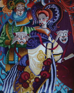
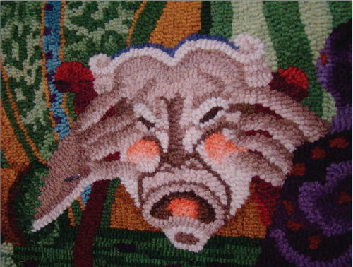
The Theft of Comedy, 36" x 48", #3-cut wool on rug warp. Designed by David Galchutt, pattern available from LC Wool ’n Silk. Hooked by Sibyl Osicka, Parma, Ohio, 2019.
I ordered The Theft of
Comedy from LCs Wool ’n Silk knowing it would be another great lesson with highlights and shadows. I have learned so much in hooking David Galchutt’s designs. He is truly an artist. I wish I had just a little of his talent.
Over the last couple of years, I have been in contact with David and have enjoyed our time communicating over the internet. After completing Theft of Comedy, I sent him a picture of it. In that e-mail I asked him what his thoughts were in designing this piece. This is a quote from him: “Most of my designs come from doing endless thumbnail sketches and doodles. As to what to paint next, I found the female figure sketch that I had done, but there wasn’t much to it. So I cut her out and taped her over a blank piece of paper then sketched some possible scenarios. (Attached sketches enclosed). Images just pop into my head while I am drawing and I do not know why. I so like theatrical subject matter; it is fun to play with the lighting and the costumes. I have always liked comedy/tragedy masks.”
For the theater, the costumes were very elaborate and the colors are so brilliant. This was a major role in designing them and also a treat for the audiences.
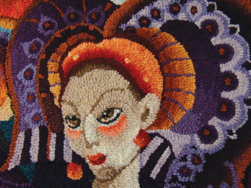
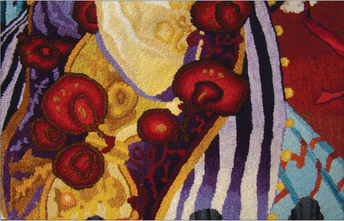
Let’s look at the lady. From her headdress to the flow of her gown, her costume is an example of excellence. I started with orange and purple for the headdress (secondary colors on the color wheel), incorporated these colors in the top of her cape, all the way through to the end that rested on her gown. The strips on her gown were also purple. I used an eight-value swatch: the light values (1 through 4) were used for the light strips; dark strips are in values 5 through 8. The swatch used for the red ribbons were also used for the flowers on her cape.
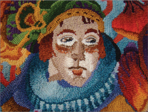
The gentleman is just as elegant as the lady. I tried to use the secondary color pallette as I did for her. I made a formula going from orange to brown, dyed over gold wool. This was used for part of his collar and jacket. By doing that, I brought the orange from her to his figure. I love moving my color around; it makes for a pleasant scene. For the green and blue, I used the TOD (Triple Over Dye) dyeing method. I used the same three dyes to make the formula but changed the large amount of dyes around. The green formula had more green dye in it; the blue formula had more blue dye.
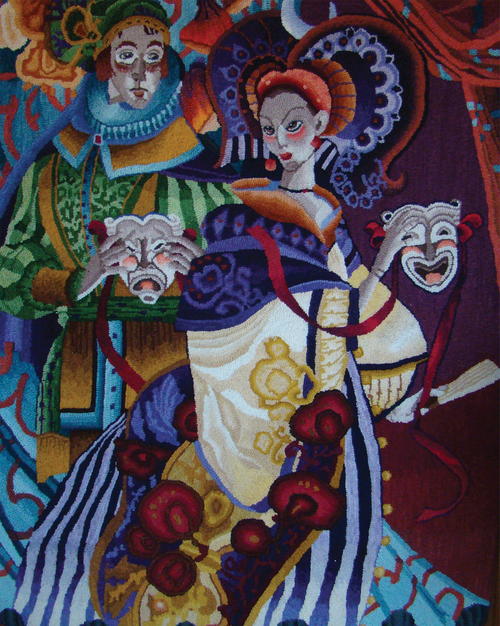
I studied the folded curtain fabric. For that I used only two swatches. The orange on the right side is the same as her headrest and the blue is the TOD swatch. The left side is the reverse of the right. The floodlight on the floor of the stage will alter the lighting of some of the motifs. The base of her gown is much lighter and the purples become stronger as it progresses up to her waist. The same is true of the theater curtains. The light alters the colors in her chest, neck, and face. The highlights are very light in value to emphasize the lighting from the floods. The masks also show the highlights from the floodlights.
I hooked the masks the same way I hooked the faces. I always start with the eyes. I complete one eye then proceed to the other. The nose is next and I will continue up to the forehead and stop at the headrest. I only hook one side of the face at a time, which is the right side. Once I have all the highlights and shadows in place, I proceed to the left. This side will be darker because of the way the head is turned and because there isn’t any reflection from the floodlights.
After completing the face, the neck is next, then the top part of the chest. I went to the headrest next and as you see, the right side is much lighter than the left.
I hooked the gentleman the same way. Eyes first, nose to the forehead and around the right side to complete all the highlights. You can see the highlights are very light. Since his head is more toward the right, there are more highlights on the left side of the face. I kept the coloration on both faces and masks using a taupe swatch. The rust for his blush was taken from her headrest. The blush on her cheeks and mask were the first value of the rose swatch. One of the most important things one can do when hooking a project is to move the colors and values around. This will balance your project.
Additional Images
-
There isn’t any wrong color; it just has to be used in the right place and the right amount.
Color, Color, Color!
- Values add dimension, harmony, and design composition.
- Learn as much as you can and then use color and value in a manner that is your own.
- Observe how the masters made color work for them. Remember that rules are made to be broken—but do it intelligently. Moderation is the key.
- Picasso once said, “If you know what you are doing, you can paint with a broomstick.”
Sibyl Osicka began rug hooking in 1982. She is McGown accredited and has been teaching in the US and Canada since 1989. She writes frequently for Rug Hooking magazine and the McGown newsletter.