The Rainbow Zoom Challenge
Inspiration from a Masterpiece
What do you do when you’re stuck at home and your friends are far away? Zoom! I’ve been Zooming with rug friends once a week since July 2020. It’s been good—checking in with each other, comparing our COVID-19 situations, sharing our projects and plans, being friends, and laughing a lot.
Rug camp on the Oregon Coast was cancelled a few weeks before our date in April 2020. It left many of us without our yearly congregation of friends at the beach, along with classes not taught nor attended. A letdown for us all. I heard about Zoom—the new program for meeting and teaching online—and I signed up for the free version and used it to check in with my students from my cancelled class. It was great. We talked about projects planned for the lost week and I went over my usual lessons via the “share” feature. Not everyone could join us, as good Wi-Fi is required, but I found Zoom to be a useful tool and a nice way to socialize from far away.
Missing my fellow-teacher friends, I asked a few to join me for a Zoom visit that July. A small group of us have been Zooming ever since: two sisters, Laurie Wiles and Louise Jenkins, in Edmonton, Alberta; Gail Becker, in Turlock, California; Barbara Larsen, in San Diego; and me in Petaluma.
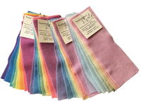
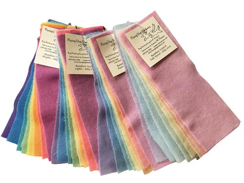
In July 2020, I replenished my rainbow swatches and added a fourth value. Stacks of beautiful rainbow pastel swatches with no place to go. I proposed a challenge to my Zoom friends based on a wonderful painting I saw at the de Young Museum in San Francisco: Frank Stella’s impressive 12-foot-square painting Lettre sur les aveugles II (1974). A rainbow of vibrant colors outlines a 12' x 12' square, with gray values in alternate outlines. The painting glows and beckons you in!
I mailed a set of the four rainbow swatches to each of the gals, while Laurie and Louise dyed a beautiful gray swatch for each of us. The challenge was simple—design a small rug and use the rainbow and gray swatches. It felt good to have something new to work out and play with. We each worked on our challenges in our own way. When the challenge was completed, we shared our projects and comments during one of our meetings. It was a good stretch for each of us and an interesting exploration of color and value.
-
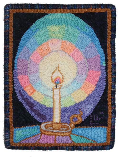
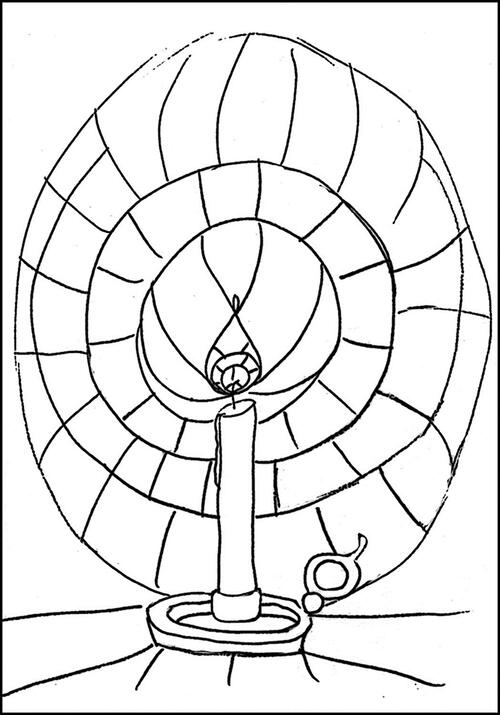
Candle Glow, 15" x 12", wool on linen. Designed and hooked by Laura Pierce, Petaluma, California, 2021.
“I had many noodles from the four swatches of the Rainbow Challenge, but not every color in every shade. I’ve been using rainbow swatches for a while, so I dug up the leftovers and added them to my new project pile. ‘Outline and fill’ is one of my favorite rug hooking techniques: gold texture outline for the candle and table, a smidge of pale gray to outline a couple of the light circles and to highlight the top of the candle holder.
“Starting with the lightest and brightest colors in the center, each circle of light was more saturated with color. Warm colors close to the flame violet. It’s traditional to run out of wool and make do, as my mother frequently did. A dark plaid background to set off the ‘glow’ and two rows of gold!”—L. P. -
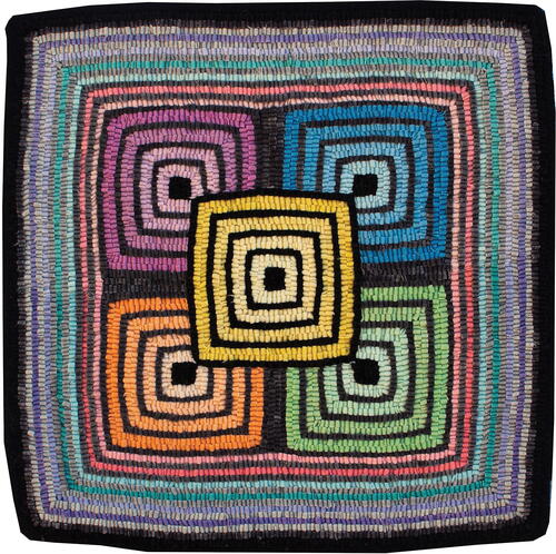
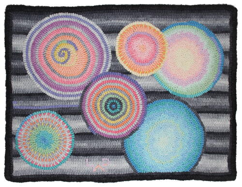
Mod Squad, 17" × 17". Designed and hooked by Laurie Wiles, Edmonton, Alberta, Canada, 2020.
“I wanted to showcase the lovely rainbow colors but avoid a pastel Easter egg feel. I think I achieved that by playing the colors off the grays. My design was mostly a happy accident. I started in the middle with a black square and started building up the colors from light to dark. Grays separated two rows of hooking, and I stepped up the values of each color as I hooked outward. Four dark squares at the four corners of the first colored square gives the illusion of overlapping. After completing all the squares, I closed them in by hooking a simple border around the five center colors. The border consists of the last three colors, hooked in two values for each outline. Working with the lighter grays in the border helped pop out the middle yellow square and soften the pink, turquoise, and purple into the background. I then went back to the darkest gray and black to frame the entire piece.
“I discovered that almost any colors work together if you put black or gray between them. Using gray helped to brighten up the colors, even though I thought it might dull them. Simple designs are very pleasing, and they look deceptively easy to do. While I hooked many straight lines, even while using the straight grain of the linen, some of my lines shifted and bowed out. This would have been much more precisely hooked on cotton rug warp. No pattern needed, just a little luck with the spacing and amount of wool! I am very happy with the way this turned out. I love the simple feel of the pattern and the nostalgic ’60s hippy vibe.
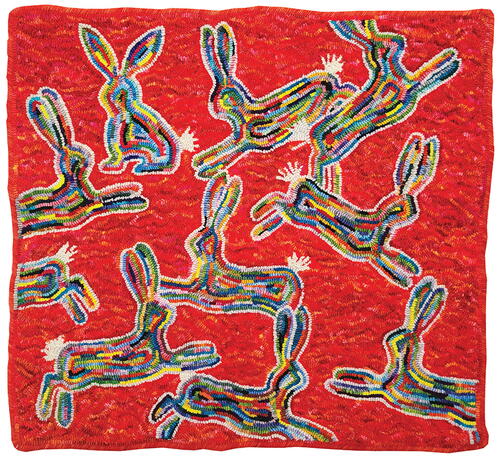
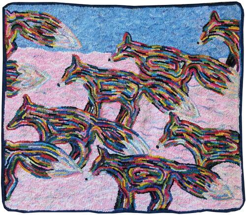
“My leftover wool was used in three other projects. First, by my sister Louise, who needed just a bit to complete her piece. The second was into my fox rugs tails and snouts, and the third into my rabbit rug tails and outlines.”—Laurie Wiles -
Rabit Rug Tails and Outlines
-
Fox Rugs Tails and Snouts
-
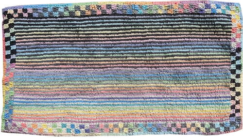
Damage to Pastels, 26" x 14". Designed and hooked by Louise Jenkins, Edmonton, Alberta, Canada, 2020.
“After we talked about Frank Stella’s artwork, I thought about Josef Albers and his color studies. He was interested in color theory and how colors interact with each other. So I thought I would explore color interactions with the pastels and the grays. I’m a good ‘higgledy-piggledy’ hooker but not very good at straight hooking, so this was my chance to improve. I tend to avoid pastels and go for bright colors, which was another challenge. I kept my design very simple so that the colors and values would do the work. I did one row of the darkest gray, then one row of the lightest pastel, then one row of the darkest gray, alternating until all of the eight different lightest-colored pastels were hooked. I then did a row of the next darkest gray, then one row of the next lightest pastel, and so on. When I finished all the straight lines, I decide to frame it with squares using the same basic concept: lightest pastels, darkest gray, and so on, until the darkest pastels were hooked with the lightest gray.
“Once it was hooked, it was hard to tell which were the lightest and darkest pastels. The gray really changes how the colors react to each other. The squares around the straight lines really pop and have a definite 3D quality. The piece has a lot of movement, which you wouldn’t expect from straight lines and small squares.
“I really enjoyed hooking this pillow once I decided on the design. I loved how the color changed and evolved while I was hooking it. I also usually change and evolve the design as I go, so this was different for me. Keeping the lines straight was definitely difficult, but the piece was easy and enjoyable to hook. I used every scrap of wool and had to borrow more gray from Laurie to complete my pillow!”—Louise Jenkins -
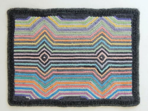
Pastel Pandemic Play, 18" x 12". Designed and hooked by Gail Becker, Turlock, California, 2020.
“Optical illusions fascinate me. I love seeing three dimensions in two-dimensional works. When I looked at Frank Stella’s art, I saw that he had many pieces that were black and white and contained optical illusions using lines. I thought I would see what would happen when I used the pastel values and grays instead of black and white. I usually avoid pastel colors in the clothes I wear, as well as in my rugs. Pastel colors seem to wash me out when I wear them, and I much prefer saturated colors in my work. For this reason, this challenge was difficult for me. But who doesn’t love a good challenge?
“I drew a pattern similar to one of Stella’s unnamed paintings that had two sets of expanding and converging lines that appeared to pop out. My pattern reversed this trend by using converging and then expanding lines to create a similar illusion.
“I began hooking in the middle of the pattern and chose to make diamonds where the lines converged to their smallest point. Hooking the darkest grays next to the lightest pastels in the middle of the rug created the greatest contrast. I expanded outward from the center with ever-lighter pastel and gray values. The middle values unsurprisingly produced the least contrast. Toward the top and bottom of the rug, more contrast appeared as the grays became almost white. This challenge pushed me to use colors I would not ordinarily use and gave me a greater understanding of contrast and how lines create illusions.”—Gail Becker -
Conics, Softened, 121 /2" x 16". Designed and hooked by Barbara Larsen, San Diego, California, 2021
“My rug hooking friends complained that I was too picky about my curves. This came up so often that I spent some time thinking about why. I decided that it stemmed from all those years in math, graphing countless functions. So, when I started to design my own pieces, I wanted to include that intuitive understanding of how curves behave. On seeing the strong lines in the inspirational piece by Frank Stella, my mind immediately drifted to curves. I wanted to emphasize the apparent contrast between math, which is perceived as stark and hard, and the rainbow wool, which is soft and pretty.
“In line with my topic, the design was constructed in Microsoft PowerPoint and via online graphing programs. The computer design included only a vague color plan using the colors of the wool. In my initial forays as a rug hooker into the elements of art, my first focus was—as is common—on color. The consideration of curves from the perspective of math analysis shifted my attention to shape. In this piece, I encountered subtler issues of interaction between shape and color.
“As I started hooking, I had more completely filled in the curves. I felt, though, that this made the design too heavy and too rigid, missing the softening I was looking for with the rainbow colors. This was the first time I had, in my own design, used the technique of allowing the eye to complete a suggested line. Besides separating the shapes, the shades of gray were also used to make the shapes into these softer fragments. I lagged on completion of my piece because when the challenge started, I was busy moving to San Diego in the middle of a pandemic. We are still getting settled, so my rainbow leftovers have not yet been put to use.”—Barbara Larsen -
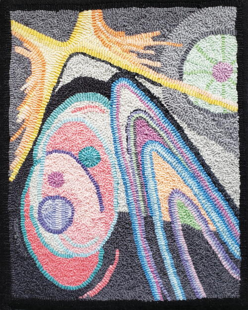
Rainbow Drops, 20" x 16", woolstrips on linen. Designed and hooked by Laura Pierce, Petaluma, California, 2020
“I had raindrops in mind, but the design turned into something more terrestrial. I knew I didn’t like working with gray, but I found out that I like working with pastel gray! It’s ‘pearly’ and complements the other pastels. I planned to use the beaded stitch for my raindrops and started out with the light gray. As the gray got darker in each row, I was soon suffering with gray mud fatigue. I moved on to the center circle and made plain rows around, alternated with grays; it was much more satisfying. Then a big circle, which started out well, soon got wonky. I gave it a whirl and moved on.
“The next circle, blue with green, was hooked with ‘random fill’; it makes blending easier and circling more forgiving. The colors blended easily, as they are related, and created a glow! The circle with the green and pink/orange also glows and tackles some tough color transitions. The little yellow-to-pink circle was the last one, using up some hot hues! The last three circles are only pastels, no grays. Now I concentrated on using up the gray wool in the background. I tried to make bars of alternating values, dark ones and light ones. It doesn’t quite work as the dark bars are too stripey. I’ll fix them with some dark violet—one of these days. It is so interesting to see how colors react to each other—which reactions I like or don’t like, and which colors have to be replaced! A couple of us ended up with leftover rainbow wool to add to the noodle pile! I was enjoying the play of color and the pursuit of the glow. Candle Glow is a little pattern I drew up in 2019; now I knew the rainbow values could make a nice glow!”—L. P -
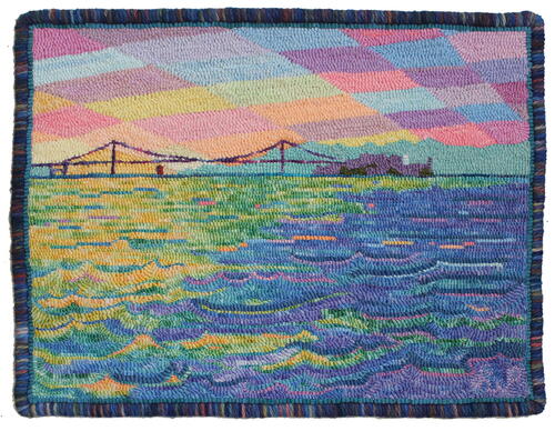
Golden Gate Sunset, 20" x 16", wool on linen. Designed and hooked by Laura Pierce, Petaluma, California, 2021.
“After hooking Candle Glow, I had more pastels and was still in a rainbow mood, so I looked for another project. Our guild had plans for a Wonderscape workshop by Brigitta Phy in Spring 2020, but it was postponed due to COVID-19. Landscapes are one of my favorite subjects, and I had several possibilities in consideration for the workshop, including a photograph of the Golden Gate Bridge from the ferry, late in the day.
“The piece is part landscape and part Wonderscape. I hooked the patterned sky with the lightest pastels. The bridge and Alcatraz are a dark purple silhouette, while the Marin Headlands are a pastel silhouette. The water is hooked with two long transitional spots, hand-dyed to create the bay waters. When it was all hooked, the rug needed some dark contrast to balance out the overall brightness and light. Selecting the bits behind the wave tops, I replaced strips with dark green. I added a few more pastel highlights and finished it with a dark border. Sometimes the sky seems like a patchwork quilt, covering up the day. (You can see more about this piece in Celebration 32!)”—L.P -
I’m happy to share my little Candle Glow pattern. It’s just a little sketch, but you can add some lines as desired.
It’s about 7” x 10”; I made my pattern about 10" x 14". You can make it as big or small as you like.
Looking back on our challenge and responses to pastel colors, I see that we’re now all more familiar with the mettle of pastels. It’s interesting to hear how each of us approached our designs and color plans. It was surprising to see how the colors changed in subtle ways while still maintaining some of their original characteristics! RHM
Laura Pierce has been hooking since 1996. She started teaching in 2003 and was inducted into the Celebration Hall of Fame in 2018.