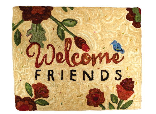
Welcome Friends
One design, three interpretations

Welcome Friends; 24 1⁄2"x 20", #4-, 6-, and 8-cut dyed and recycled wool on linen. Designed and hooked by Ellen Banker, Williamsburg, Virginia, 2016.
This rug illustrates a contrasting relationship of type. The word “Welcome” was drawn based on a script typeface called Heart and Soul. The word “Friends” was set in Futura Medium. The result: type contrast. The contrast carried through into the color choices as well.
Signs are so widespread that we hardly notice them. And, according to the International Sign Association in Alexandria, Virginia, we don’t really consider the effect signs have on us which, they claim, is precisely why signs are so effective. Ah, an effective sign sounds like a design element worthy of a hooked rug.
To dive a little deeper into the subject: Signs generally—but not always—contain words. And signs are generally—but not always—created for a specific purpose. Think about information (a facility’s name, a map, or instructions); persuasion (promotional signs for brands or products or a sale); identification (room names or numbers); and safety (warning signs, traffic signs, exit signs).
For a softer approach, let’s look at another utilitarian use for signs: hospitality. Utilitarian, but gracious and sweet, a welcome sign can offer a warm greeting to your guests and find an appropriately welcoming spot on your entryway wall or floor.
This exclusive RHM Welcome Friends pattern was created to welcome, of course, but also to introduce several methods of hooking type in rugs. This pattern includes two different typefaces and methods of incorporating lettering into your rug designs.
Read NextMagpie Cherry Pie


